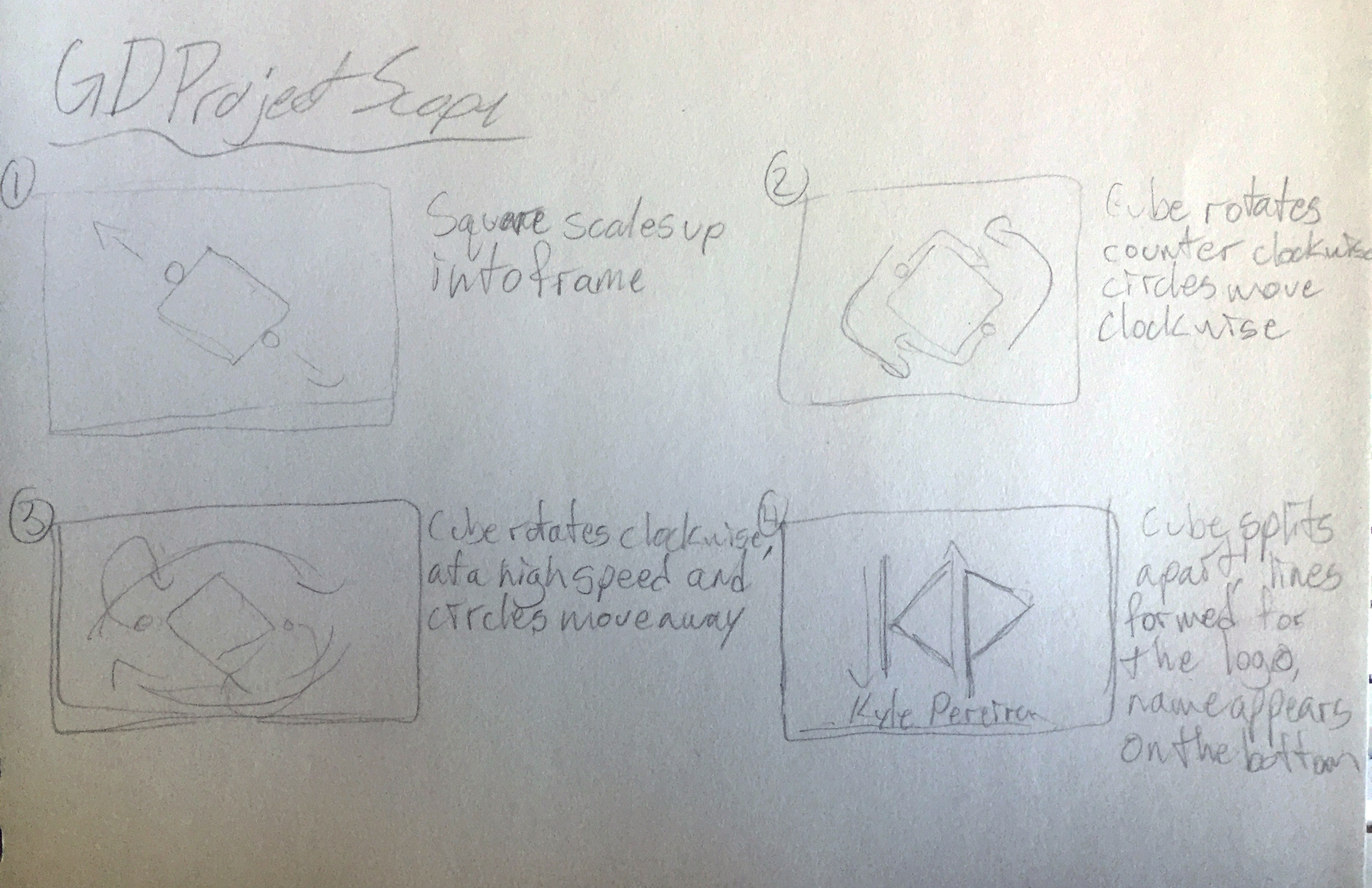
Kyle Pereira

Personal Logo Branding

This personal branding includes a logo, social media elements, and an animation of my logo.

The Idea

My starting point for this project was that I wanted to have a motion piece I would be able to use for myself for the future. So I felt animating a personal logo for myself would work best, and it could be used for a motion reel, as well as other projects in the future. Having this put at the start of my motion pieces and my site leaves people with something to remember who I am, especially if they’ve seen multiple of my works. With this I though it would be best to further expand on this brand by working on some social media elements by making headers, and making a wordmark from what would have originally just been a simple logo.

First Storyboards

My first sketches were just some simple storyboards I did to get my ideas out on paper. This first concept didn’t really go anywhere but I do think it helped set me on the right track. I had a slight idea of what I wanted my logo to look like so I was trying to make an animation based on that. For the logo I wanted it to take the arm and leg from the K and the bowl from the P of my initials and simplify them. The elements from both those letters when pressed together form a square, but only with the P simplified into 2 lines rather than a circle. With my idea for the logo in my mind I decided it would be best to iron it out rather than continue to work on my animation.

First Sketches

With my logo idea from my storyboards in mind I got to work on sketching for my logo, all around the one concept. There were a few that deviated a bit from the original idea but they didn’t appeal to me much. While sketching for these I did keep in mind how I might want to animate each one. Overall I had a few ideas that I would have liked to work with, and most were ones I could see working well in an animation. It was around this stage I started having my thoughts on expanding this project to more personal brand elements. It started with thoughts on how some logos would look as wordmarks and how the wordmark may be included in the animation. Then from there I thought about the inclusion of both a logo and wordmark for social media.

Final Logo Sketch

This sketch is a more simplified version of my previous one, removing the two bars and sticking with just the chevrons was great to be used both horizontal and vertical. The first chevron representing the the K and the second for the P in my initials. This was probably as simplified as this could go, and I did prefer to have the logo symmetrical rather than use something rounded for the second chevron. With this version when it’s used as a wordmark each chevron is right beside my initial that it represents.

Final Logo Vectors

With some slight changes from the sketches I have my final wordmark and logo with colour. I find the stacking in the wordmark was successful and from here I just looked to think about storyboarding for the final animation.

Animation Storyboard

For the storyboards I just looked to keep it very simple. My original ideas were maybe too overcomplicated. Not that it’s a bad thing but I didn’t want anything too obnoxious, just something quick and flashy, and for something in a motion reel I wouldn’t want it to overshadow my main pieces.

Snap Lens and Social Headers

After the storyboards I finished up the animation and had it uploaded to Vimeo which was posted at the top of this page. In addition to watching the animation on Vimeo you can scan this snaplens with your phone if you have snapchat. From there point your camera to my wordmark higher up on the page and the animation will play on your screen. The headers I made with my wordmark aren't anything too complicated and can be seen on either my Twitter or Behance, links to those can be found on my contact page.